Hunter Palettes Journal
Best Beige Palettes for Branding: Neutral Color Ideas for Calm, Refinement, and Timeless Style
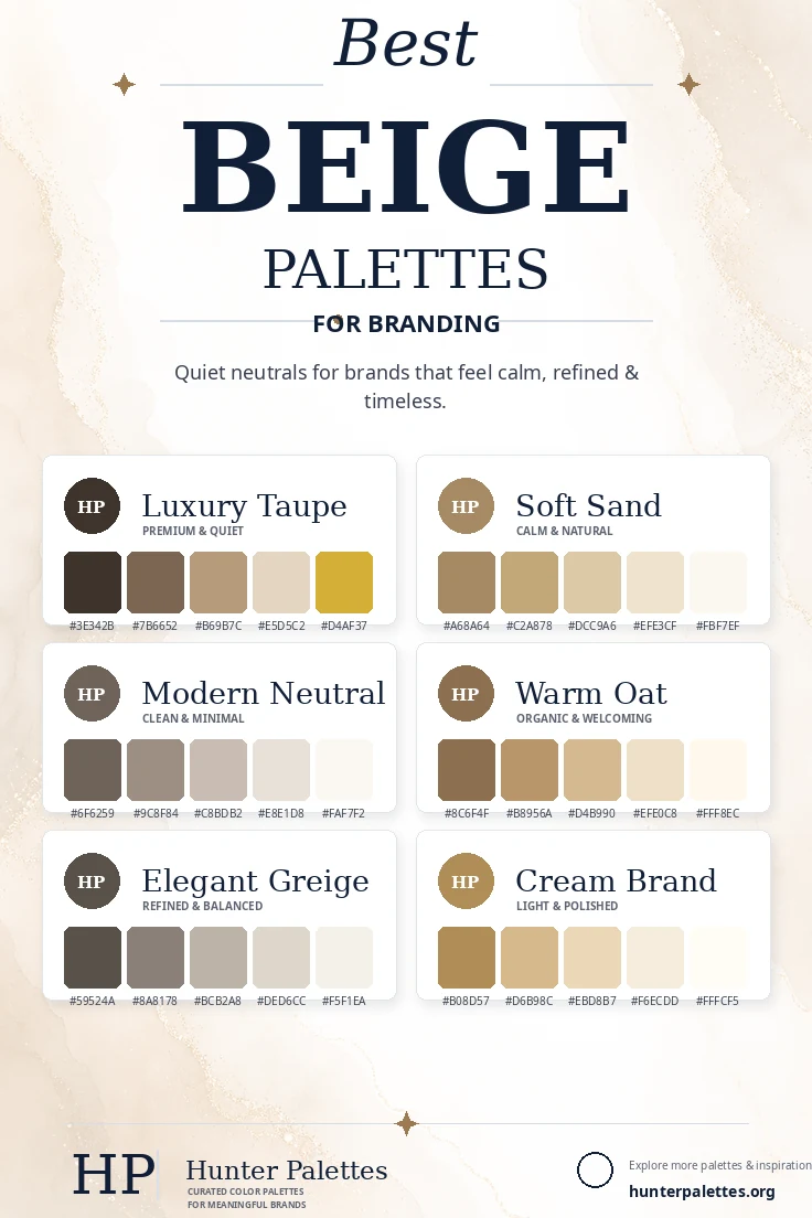
Explore six curated beige color palettes for branding, including luxury taupe, soft sand, modern neutral, warm oat, elegant greige, and cream brand.
Beige is one of the most useful neutral families in brand design. It can feel calm, warm, refined, organic, minimal, or luxurious depending on the undertone and contrast level. A beige palette gives a brand quiet polish without competing with photography, typography, or product details. Taupe adds depth, sand feels natural, greige feels modern, and cream creates a soft elevated foundation. In this guide, you will find six carefully curated beige color palettes for branding, each with HEX codes, personality notes, and practical ideas for logos, websites, packaging, social graphics, and complete identity systems.
Why Beige Works So Well in Brand Design
Beige is calm, versatile, and easy to pair with both warm and cool accents. It helps a brand feel intentional and approachable while giving layouts enough softness for editorial design, lifestyle photography, and premium packaging. The strongest beige palettes still need contrast. Dark taupe, coffee, greige, or muted brown can anchor the system, while ivory, cream, sand, and oatmeal tones provide breathable backgrounds.
Luxury Taupe Palette
The Luxury Taupe palette is quiet, premium, and sophisticated. Dark taupe creates structure, soft beige adds warmth, and gold brings a refined accent.
This palette works beautifully for luxury interiors, boutique hotels, premium skincare, jewelry, fashion, packaging, and elegant personal brands.
Best for: luxury interiors, boutique hotels, premium skincare, jewelry, fashion, packaging, and refined identities.
Soft Sand Palette
The Soft Sand palette is calm, natural, and approachable. It feels warm without becoming heavy, making it useful for relaxed lifestyle branding.
Use this palette for wellness brands, home goods, beach-inspired businesses, ceramics, cafes, organic products, and soft editorial websites.
Best for: wellness, home goods, coastal brands, ceramics, cafes, organic products, and soft editorial websites.
Modern Neutral Palette
The Modern Neutral palette is clean, minimal, and balanced. It uses beige-gray undertones to create a contemporary brand system.
This palette is ideal for architecture studios, SaaS brands with a calm aesthetic, portfolios, interior designers, agencies, and minimalist ecommerce.
Best for: architecture, calm SaaS branding, portfolios, interiors, agencies, minimalist ecommerce, and modern identities.
Warm Oat Palette
The Warm Oat palette is cozy, organic, and welcoming. Oat and wheat tones create comfort while still feeling polished.
It works well for bakeries, cafes, handmade products, family brands, wellness packaging, home goods, and warm lifestyle content.
Best for: bakeries, cafes, handmade products, family brands, wellness packaging, home goods, and warm lifestyle content.
Elegant Greige Palette
The Elegant Greige palette is refined, balanced, and timeless. Greige sits between gray and beige, giving the brand a calm modern foundation.
Choose this palette for interior design, wedding brands, boutique services, editorial websites, premium stationery, and quiet luxury identities.
Best for: interior design, wedding branding, boutique services, editorial websites, premium stationery, and quiet luxury identities.
Cream Brand Palette
The Cream Brand palette is light, warm, and polished. It creates a bright neutral system that feels soft and elevated.
This palette works beautifully for skincare, wellness, hospitality, lifestyle blogs, packaging, stationery, and brands that want a gentle premium look.
Best for: skincare, wellness, hospitality, lifestyle blogs, packaging, stationery, and gentle premium identities.
How to Choose the Right Beige Palette for Your Brand
Choosing the right beige palette depends on the level of contrast and warmth your brand needs. For premium restraint, choose Luxury Taupe. For a natural calm identity, use Soft Sand. For clean minimal branding, choose Modern Neutral. For warmth and comfort, use Warm Oat. For balanced sophistication, choose Elegant Greige. For a light polished direction, use Cream Brand.
A strong brand palette should do more than look beautiful. It should support your message across your logo, website, packaging, photography, social media templates, email design, and printed materials. Test your colors on light and dark backgrounds, and make sure accents have enough contrast for buttons, labels, and calls to action.
Final Thoughts
Beige color palettes can make a brand feel calm, elevated, organic, minimal, or timeless. The best neutral systems use subtle temperature shifts and enough contrast to stay readable across digital and printed materials.
Whether you are designing a logo, planning a website color scheme, creating packaging, building a Pinterest graphic, or developing a complete brand identity, these palettes give you a flexible starting point for a visual style that feels intentional, memorable, and emotionally clear.