Hunter Palettes Journal
Best Pink Palettes for Branding: Elegant Color Ideas for Warmth, Beauty, and Connection
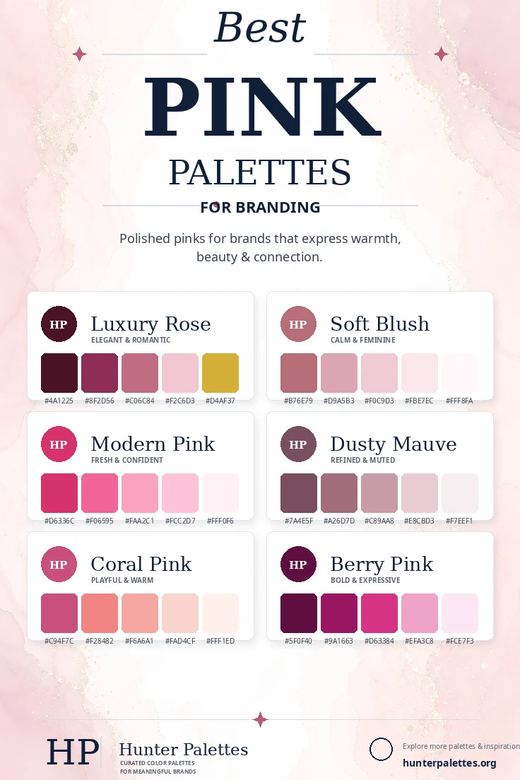
Explore six curated pink color palettes for branding, including luxury rose, soft blush, modern pink, dusty mauve, coral pink, and berry pink.
Pink is a flexible branding color that can feel soft, elegant, expressive, playful, romantic, or editorial. It is often associated with warmth and beauty, but the right palette can make pink feel much broader than a single feminine style. A blush palette can create calm and grace, while berry pink feels bold and expressive. Mauve creates refinement, coral pink adds warmth, and rose tones can feel premium when paired with deeper shades and metallic accents. In this guide, you will find six carefully curated pink color palettes for branding, each with HEX codes, personality notes, and practical ideas for logos, websites, packaging, social graphics, and full visual identity systems.
Why Pink Works So Well in Brand Design
Pink is emotionally warm and visually expressive. It can help a brand feel caring, beautiful, creative, approachable, romantic, or confident, depending on saturation and contrast. The most effective pink palettes avoid relying on one flat shade. Pairing pink with wine, cream, mauve, coral, berry, or gold gives the palette more range and makes it easier to use across typography, backgrounds, buttons, packaging, and photography direction.
Luxury Rose Palette
The Luxury Rose palette is elegant, romantic, and refined. Deep rose creates depth, blush adds softness, and gold brings a premium accent.
This palette works beautifully for beauty brands, wedding studios, luxury packaging, florists, boutique hotels, jewelry, and refined personal brands.
Best for: beauty branding, weddings, luxury packaging, florists, boutique hotels, jewelry, and elegant identities.
Soft Blush Palette
The Soft Blush palette is calm, gentle, and graceful. It uses pale pinks with warm rose undertones to create an airy identity.
Use this palette for skincare, stationery, wellness, bridal brands, lifestyle blogs, social templates, and brands that need a soft but polished look.
Best for: skincare, stationery, wellness, bridal branding, lifestyle blogs, social templates, and soft polished identities.
Modern Pink Palette
The Modern Pink palette is fresh, confident, and energetic. It keeps the color bright while lighter tints create balance and flexibility.
This palette is ideal for beauty tech, creative studios, ecommerce, events, fitness, social media graphics, and brands that want a bold optimistic personality.
Best for: beauty tech, creative studios, ecommerce, events, fitness, social graphics, and optimistic brand identities.
Dusty Mauve Palette
The Dusty Mauve palette is muted, refined, and timeless. It gives pink an editorial quality that feels mature and understated.
It works well for interior design, wedding stationery, therapy practices, boutique services, slow fashion, editorial websites, and sophisticated lifestyle brands.
Best for: interiors, wedding stationery, therapy practices, boutique services, slow fashion, editorial websites, and sophisticated lifestyle brands.
Coral Pink Palette
The Coral Pink palette is warm, friendly, and playful. Coral shifts pink toward peachy red, making the palette feel sunny and approachable.
Choose this palette for cafes, beauty products, summer campaigns, lifestyle brands, kids products, social graphics, and cheerful packaging.
Best for: cafes, beauty products, summer campaigns, lifestyle brands, kids products, social graphics, and cheerful packaging.
Berry Pink Palette
The Berry Pink palette is bold, expressive, and memorable. Its deep berry tones create drama, while lighter pinks keep the system usable.
This palette works beautifully for fashion, beauty, creative agencies, music or event branding, statement packaging, and brands with a confident voice.
Best for: fashion, beauty, creative agencies, events, statement packaging, music branding, and confident visual identities.
How to Choose the Right Pink Palette for Your Brand
Choosing the right pink palette starts with tone. For a premium romantic identity, choose Luxury Rose. For softness and calm, use Soft Blush. For a bright confident brand, choose Modern Pink. For muted refinement, use Dusty Mauve. For warmth and playfulness, choose Coral Pink. For expressive depth, Berry Pink is a strong option.
A strong brand palette should do more than look beautiful. It should support your message across your logo, website, packaging, photography, social media templates, email design, and printed materials. Test your colors on light and dark backgrounds, and make sure accents have enough contrast for buttons, labels, and calls to action.
Final Thoughts
Pink color palettes can make a brand feel graceful, modern, romantic, playful, editorial, or bold. The best pink systems use contrast and supporting neutrals so the color feels intentional across every brand touchpoint.
Whether you are designing a logo, planning a website color scheme, creating packaging, building a Pinterest graphic, or developing a complete brand identity, these palettes give you a flexible starting point for a visual style that feels intentional, memorable, and emotionally clear.