Hunter Palettes Journal
Best Yellow Palettes for Branding: Bright Color Ideas for Optimism, Warmth, and Clarity
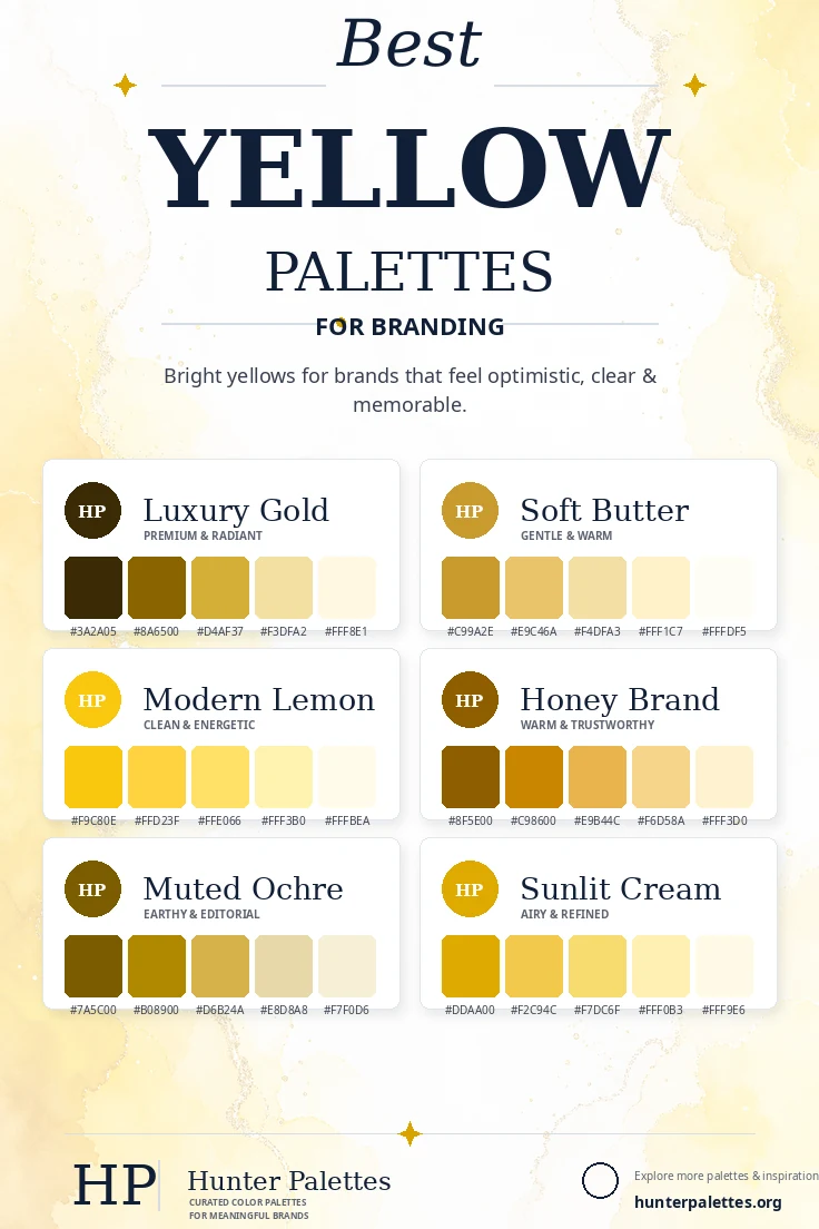
Explore six curated yellow color palettes for branding, including luxury gold, soft butter, modern lemon, honey brand, muted ochre, and sunlit cream.
Yellow is a bright, optimistic, and highly memorable color for branding. It can feel cheerful, intelligent, warm, premium, natural, or energetic depending on the shade you choose. Because yellow is so visible, it works best when it is balanced with grounded neutrals, soft creams, deep browns, muted golds, or plenty of white space. That balance helps yellow feel intentional instead of overwhelming. In this guide, you will find six carefully curated yellow color palettes for branding, each with HEX codes, personality notes, and practical ideas for logos, websites, packaging, social graphics, and full identity systems.
Why Yellow Works So Well in Brand Design
Yellow is associated with optimism, clarity, friendliness, creativity, sunshine, and positive energy. It can help a brand feel welcoming and easy to remember, especially when used as an accent or a strong signature color. The right yellow depends on the mood you want. Gold feels premium, butter yellow feels soft and charming, lemon yellow feels modern and energetic, honey tones feel warm and trustworthy, ochre feels earthy, and pale cream-yellow feels refined and light.
Luxury Gold Palette
The Luxury Gold palette is radiant, elegant, and premium. Deep brown-gold tones create weight, while metallic gold and pale cream add polish.
This palette works beautifully for luxury products, jewelry, hospitality, premium packaging, beauty, finance, and elegant personal brands.
Best for: luxury branding, jewelry, hospitality, premium packaging, beauty, finance, and refined brand identities.
Soft Butter Palette
The Soft Butter palette is gentle, warm, and approachable. It gives yellow a softer voice that feels charming without becoming too loud.
Use this palette for bakeries, lifestyle brands, stationery, family-focused products, cozy cafes, handmade goods, and warm editorial websites.
Best for: bakeries, lifestyle branding, stationery, cafes, handmade goods, family products, and warm websites.
Modern Lemon Palette
The Modern Lemon palette is clean, energetic, and optimistic. It uses bright yellow with lighter tints to create a crisp visual system.
This palette is ideal for creative studios, education brands, productivity apps, modern campaigns, event branding, social graphics, and youthful ecommerce.
Best for: creative studios, education, productivity apps, campaigns, events, social graphics, and modern ecommerce.
Honey Brand Palette
The Honey Brand palette is warm, trustworthy, and natural. It feels richer than lemon yellow and more approachable than metallic gold.
It works well for food brands, cafes, wellness products, natural skincare, home goods, farmers markets, and brands that want a grounded golden identity.
Best for: food branding, cafes, wellness products, skincare, home goods, markets, and warm natural identities.
Muted Ochre Palette
The Muted Ochre palette is earthy, mature, and editorial. Ochre brings warmth with restraint, making it useful for brands that want character without brightness.
Choose this palette for interior studios, ceramics, slow fashion, editorial content, organic products, cultural projects, and thoughtful lifestyle brands.
Best for: interiors, ceramics, slow fashion, editorial content, organic products, cultural projects, and thoughtful lifestyle brands.
Sunlit Cream Palette
The Sunlit Cream palette is light, polished, and uplifting. It creates a bright identity that still feels refined because the supporting shades are soft and creamy.
This palette works beautifully for wellness, beauty, summer campaigns, lifestyle blogs, clean packaging, hospitality, and sunny website designs.
Best for: wellness, beauty, summer campaigns, lifestyle blogs, clean packaging, hospitality, and sunny websites.
How to Choose the Right Yellow Palette for Your Brand
Choosing the right yellow palette depends on how much energy your brand should carry. For a premium look, choose Luxury Gold. For softness and charm, use Soft Butter. For a bright modern identity, choose Modern Lemon. For warmth and trust, use Honey Brand. For an earthy editorial direction, choose Muted Ochre. For an airy refined system, use Sunlit Cream.
A strong brand palette should do more than look beautiful. It should support your message across your logo, website, packaging, photography, social media templates, email design, and printed materials. Test your colors on light and dark backgrounds, and make sure accents have enough contrast for buttons, labels, and calls to action.
Final Thoughts
Yellow color palettes can make a brand feel optimistic, premium, friendly, warm, editorial, or bright. The strongest yellow palettes control contrast carefully and use neutrals to give the color room to breathe.
Whether you are designing a logo, planning a website color scheme, creating packaging, building a Pinterest graphic, or developing a complete brand identity, these palettes give you a flexible starting point for a visual style that feels intentional, memorable, and emotionally clear.