Hunter Palettes Journal
Best Red Palettes for Branding: Bold Color Ideas for Passion, Energy, and Impact
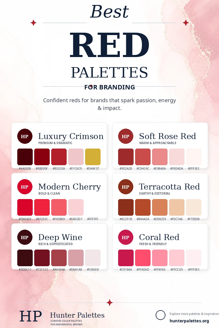
Explore six curated red color palettes for branding, including luxury crimson, soft rose red, modern cherry, terracotta red, deep wine, and coral red.
Red is one of the most emotionally powerful colors in branding. It can feel passionate, confident, luxurious, warm, energetic, or editorial depending on the shade and the supporting colors around it. For brand design, red is especially useful when you want a visual identity with presence. Deep crimson can feel premium and dramatic, cherry red brings clarity and momentum, rose red softens the mood, and terracotta adds grounded warmth. In this guide, you will find six carefully curated red color palettes for branding, each with HEX codes, personality notes, and practical ideas for logos, websites, packaging, campaigns, and complete identity systems.
Why Red Works So Well in Brand Design
Red naturally attracts attention, which makes it useful for brands that need energy, appetite appeal, urgency, confidence, or emotional warmth. It can also become sophisticated when paired with blush, cream, wine, charcoal, or metallic accents. The key is choosing the right intensity. Bright reds feel active and direct. Dark reds feel rich and established. Muted reds and terracotta tones feel tactile, warm, and editorial. A strong red palette should balance impact with enough softness or neutral space to stay usable across a full brand system.
Luxury Crimson Palette
The Luxury Crimson palette is dramatic, polished, and memorable. Deep red shades create a premium foundation, while pale rose softens the contrast and gold adds a refined accent.
This palette works beautifully for high-end restaurants, luxury packaging, beauty brands, wine labels, jewelry, boutique hotels, and personal brands that need a confident signature color.
Best for: luxury branding, premium packaging, beauty, hospitality, wine labels, jewelry, and sophisticated visual identities.
Soft Rose Red Palette
The Soft Rose Red palette keeps the emotional warmth of red but makes it more approachable. Rose and blush tones create a gentler identity that still has depth and recognition.
Use this palette when you want red to feel human, romantic, caring, and polished rather than aggressive. It is especially useful for lifestyle brands, florists, cafes, stationery, wellness businesses, and social content.
Best for: lifestyle branding, florists, cafes, stationery, wellness, romantic campaigns, and approachable brand identities.
Modern Cherry Palette
The Modern Cherry palette is bright, clean, and highly visible. It gives brands a bold digital personality while the light pink and white tones keep the system crisp.
This palette is a strong fit for apps, campaigns, food brands, sports-adjacent visuals, modern ecommerce, event branding, and social graphics that need immediate attention.
Best for: digital products, campaigns, food branding, ecommerce, events, social media graphics, and energetic identities.
Terracotta Red Palette
The Terracotta Red palette is warm, earthy, and editorial. It trades sharp intensity for clay-like richness, making the brand feel tactile and grounded.
It works well for ceramics, home goods, slow fashion, organic food, cafes, interior studios, handmade products, and brands that want a natural but distinctive color story.
Best for: ceramics, interiors, cafes, slow fashion, organic food, home goods, and earthy editorial branding.
Deep Wine Palette
The Deep Wine palette is rich, moody, and sophisticated. Burgundy and wine tones create depth, while dusty pinks prevent the palette from feeling too heavy.
Choose this palette for brands that want a mature, elegant, and expressive identity. It is especially effective for editorial websites, luxury services, beauty, hospitality, and premium personal brands.
Best for: editorial websites, luxury services, beauty brands, hospitality, premium personal brands, and refined packaging.
Coral Red Palette
The Coral Red palette is fresh, friendly, and expressive. It keeps red energetic but adds a softer pink-coral direction that feels more playful and optimistic.
This palette works beautifully for beauty brands, wellness apps, creative studios, youth-focused products, social templates, and cheerful packaging systems.
Best for: beauty branding, wellness apps, creative studios, social graphics, youthful products, and playful packaging.
How to Choose the Right Red Palette for Your Brand
Choosing the right red palette starts with the feeling your brand needs to create. For a premium identity, choose Luxury Crimson. For warmth and approachability, use Soft Rose Red. For bold digital clarity, choose Modern Cherry. For an earthy editorial look, use Terracotta Red. For richness and depth, choose Deep Wine. For a brighter friendly identity, Coral Red is a strong option.
A strong brand palette should do more than look beautiful. It should support your message across your logo, website, packaging, photography, social media templates, email design, and printed materials. Test your colors on light and dark backgrounds, and make sure accents have enough contrast for buttons, labels, and calls to action.
Final Thoughts
Red color palettes can make a brand feel powerful, expressive, romantic, refined, energetic, or grounded. The difference comes from contrast, undertone, and the neutrals you use to support the main red shades.
Whether you are designing a logo, planning a website color scheme, creating packaging, building a Pinterest graphic, or developing a complete brand identity, these palettes give you a flexible starting point for a visual style that feels intentional, memorable, and emotionally clear.