Blue is one of the most powerful colors in branding. It communicates trust, stability, clarity, professionalism, and calmness, making it a favorite choice for brands across industries such as technology, finance, wellness, consulting, real estate, and luxury services.
But not every blue palette feels the same. A deep navy can look elegant and authoritative, while aqua tones feel fresh and uplifting. Soft dusty blues can create a refined and graceful identity, while corporate blues help a brand feel reliable and approachable.
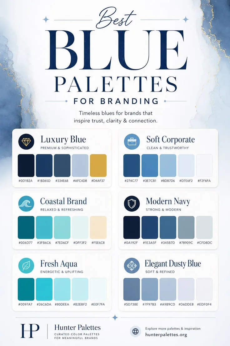
In this guide, you will find six carefully curated blue color palettes for branding, each with its own personality, HEX codes, and practical design inspiration.
Why Blue Is So Effective in Brand Design
Blue is often associated with reliability, intelligence, peace, loyalty, and professionalism. That makes it especially useful for brands that want to build confidence and create a sense of connection with their audience.
The key is choosing the right type of blue. Darker blues can feel premium and established. Soft blues can feel calm and clean. Aqua and teal shades add energy and freshness. When combined thoughtfully, blue palettes can help your brand look polished, memorable, and emotionally consistent.
Luxury Blue Palette
The Luxury Blue palette is designed for brands that want to feel premium, elegant, and sophisticated. The deep navy shades create a strong and timeless foundation, while the muted light blue adds softness and balance. The gold accent brings a refined luxury touch without making the palette feel too decorative.
This palette works beautifully for high-end service providers, financial consultants, jewelry brands, luxury packaging, premium personal brands, and elegant website designs.
Best for: luxury branding, premium logos, elegant websites, high-end packaging, finance, consulting, and sophisticated brand identities.
Soft Corporate Palette
The Soft Corporate palette is clean, trustworthy, and modern. It gives brands a professional look without feeling cold or overly formal. The mid-tone blues add confidence, while the lighter shades create a sense of openness and clarity.
This is a strong choice for companies that want to look reliable but still approachable. It works especially well for SaaS brands, corporate websites, healthcare platforms, finance startups, educational businesses, and consulting services.
Best for: SaaS branding, corporate websites, healthcare, education, finance, business consulting, and clean digital products.
Coastal Brand Palette
The Coastal Brand palette feels relaxed, refreshing, and natural. It combines deep teal, aqua, soft mint, and warm sand tones to create a color story inspired by the ocean, beach landscapes, and calm summer days.
This palette is ideal for brands that want to communicate freshness, balance, wellness, and a more organic lifestyle. It can work beautifully for travel brands, skincare businesses, wellness studios, coastal interior design, lifestyle blogs, and eco-conscious products.
Best for: wellness branding, travel websites, skincare, lifestyle content, coastal interiors, summer campaigns, and refreshing brand identities.
Modern Navy Palette
The Modern Navy palette is strong, minimal, and refined. It uses dark navy as the main anchor color and balances it with muted blue-gray shades. The result feels serious and professional, but still modern and visually calm.
This palette is a great fit for brands that need a confident and polished visual identity. It works well for technology companies, architecture studios, law firms, finance brands, creative agencies, portfolio websites, and modern business platforms.
Best for: tech branding, law firms, architecture studios, finance websites, modern portfolios, and minimalist brand identities.
Fresh Aqua Palette
The Fresh Aqua palette is bright, energetic, and uplifting. It feels clean and modern, making it a great option for brands that want to communicate freshness, creativity, movement, and optimism.
Because this palette uses lighter and more vibrant blue tones, it works especially well for digital-first brands, wellness apps, beauty businesses, creative studios, fitness platforms, social media graphics, and youthful brand identities.
Best for: wellness apps, beauty branding, fitness platforms, creative studios, modern social graphics, and fresh website designs.
Elegant Dusty Blue Palette
The Elegant Dusty Blue palette is soft, refined, and timeless. Unlike brighter blue palettes, dusty blue has a muted quality that feels calm, graceful, and sophisticated. It is perfect for brands that want to look polished without feeling too bold or corporate.
This palette is especially useful for wedding brands, interior design studios, stationery businesses, boutique brands, lifestyle blogs, feminine branding, and elegant website layouts. It creates a quiet sense of beauty and works well with serif typography, soft photography, and minimalist design elements.
Best for: wedding branding, boutique businesses, interiors, stationery, elegant blogs, lifestyle brands, and refined visual identities.
How to Choose the Right Blue Palette for Your Brand
Choosing the right blue palette depends on the emotion and message you want your brand to communicate.
For a premium and sophisticated identity, choose Luxury Blue. For a clean and trustworthy business look, use Soft Corporate. For a relaxed, refreshing, and natural brand style, choose Coastal Brand. For a strong and minimal identity, Modern Navy is a great option. For a bright and energetic brand, use Fresh Aqua. For a soft and refined visual direction, choose Elegant Dusty Blue.
A strong brand palette should do more than look beautiful. It should support your message, attract the right audience, and stay consistent across your logo, website, social media, packaging, and marketing materials.
Final Thoughts
Blue color palettes are incredibly versatile. They can make a brand feel luxurious, professional, calm, modern, refreshing, or elegant depending on the tones you choose.
Whether you are designing a logo, creating a website color scheme, building a Pinterest graphic, planning a mood board, or developing a full brand identity, these blue palettes can help you create a visual style that feels trustworthy, memorable, and polished.