Hunter Palettes Journal
Best Green Palettes for Branding: Fresh Color Ideas for Growth, Balance, and Trust
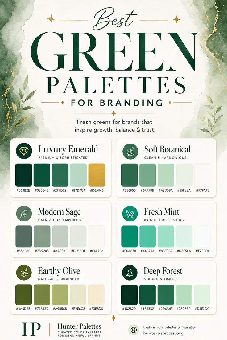
Explore six curated green color palettes for branding, including luxury emerald, soft botanical green, modern sage, fresh mint, earthy olive, and deep forest.
Green is one of the most versatile colors in brand design. It can feel fresh, natural, stable, luxurious, restorative, or quietly sophisticated depending on the tones you choose and the way you combine them.
For branding, green is especially useful because it carries strong emotional associations with growth, balance, renewal, health, sustainability, and trust. A deep emerald palette can feel premium and polished, while sage green feels calm and refined. Mint creates a lighter and more energetic impression, and olive brings warmth, earthiness, and character.
In this guide, you will find six carefully curated green color palettes for branding, each with HEX codes, personality notes, and practical ideas for logos, websites, packaging, social graphics, and full visual identity systems.
Why Green Works So Well in Brand Design
Green sits between warm and cool color families, which makes it unusually flexible. It can look organic and grounded, but it can also feel clean, modern, and premium. That range makes green a strong choice for brands that want to communicate both emotional warmth and visual clarity.
The right green palette depends on the message you want your brand to send. Dark greens can suggest heritage, confidence, and luxury. Soft botanical shades feel nurturing and natural. Sage green is elegant and calm. Mint adds freshness and optimism. Olive creates a more earthy and editorial mood, while forest green feels strong, established, and trustworthy.
Luxury Emerald Palette
The Luxury Emerald palette is rich, elegant, and refined. Deep emerald tones create a premium foundation, while the softer green adds balance and the gold accent brings a polished luxury detail.
This palette is a strong choice for brands that want to feel established, graceful, and memorable. It works beautifully for boutique hotels, jewelry brands, premium wellness studios, luxury packaging, financial consultants, and high-end personal brands.
Best for: luxury branding, premium packaging, boutique websites, financial services, jewelry, wellness, and sophisticated brand identities.
Soft Botanical Palette
The Soft Botanical palette feels clean, nurturing, and natural. It uses medium green as the anchor and surrounds it with airy botanical tones that create a calm, open, and approachable identity.
This palette is ideal for brands that want to look organic without feeling rustic. It works well for skincare, wellness products, nutrition brands, plant shops, lifestyle blogs, sustainable businesses, and calm editorial websites.
Best for: skincare branding, wellness websites, plant shops, nutrition brands, sustainable products, lifestyle content, and soft natural identities.
Modern Sage Palette
The Modern Sage palette is calm, contemporary, and understated. Sage green has a muted quality that makes a brand feel thoughtful and polished without becoming too formal or severe.
Use this palette when you want a refined look that still feels warm and human. It is especially effective for interior design studios, wedding brands, boutique service providers, therapy practices, stationery brands, and minimalist websites.
Best for: interiors, wedding branding, boutique services, calm websites, stationery, therapy practices, and refined lifestyle brands.
Fresh Mint Palette
The Fresh Mint palette is bright, clean, and optimistic. It gives green a more energetic personality, making it useful for brands that want to feel modern, healthy, and easy to approach.
Because this palette includes lighter mint tones, it can make digital products and marketing graphics feel open and crisp. It works well for wellness apps, dental brands, beauty products, fitness platforms, clean tech startups, and fresh social media visuals.
Best for: wellness apps, beauty branding, dental brands, fitness platforms, clean tech, fresh packaging, and modern digital products.
Earthy Olive Palette
The Earthy Olive palette is natural, grounded, and warm. Olive green has an editorial quality that feels more mature than bright green, especially when paired with soft cream and muted yellow-green tones.
This palette is a great fit for brands that want to feel honest, tactile, and connected to the natural world. It can work beautifully for organic food brands, cafes, outdoor products, ceramic studios, slow fashion, home goods, and lifestyle packaging.
Best for: organic food, cafes, slow fashion, outdoor brands, ceramics, home goods, editorial packaging, and grounded visual identities.
Deep Forest Palette
The Deep Forest palette is strong, trustworthy, and quietly dramatic. Its darker greens create depth and confidence, while the lighter greens keep the palette from feeling too heavy.
This palette is useful for brands that need a stable, premium, and nature-connected identity. It works well for environmental organizations, architecture studios, outdoor brands, finance brands with an organic tone, heritage products, and sophisticated websites.
Best for: environmental branding, outdoor products, architecture, premium websites, heritage brands, finance, and confident nature-inspired identities.
How to Choose the Right Green Palette for Your Brand
Choosing the right green palette starts with the emotional direction of your brand.
For a premium and polished identity, choose Luxury Emerald. For a softer natural look, use Soft Botanical. For calm refinement, Modern Sage is a strong option. For a fresh and energetic brand, choose Fresh Mint. For an earthy and warm identity, use Earthy Olive. For a deeper, stronger, and more established impression, choose Deep Forest.
A strong green palette should support more than the logo. It should work across your website, packaging, photography direction, typography choices, social media templates, email design, and printed materials. Test your greens on light and dark backgrounds, and make sure your accent colors have enough contrast for buttons, labels, and calls to action.
Final Thoughts
Green color palettes can help a brand feel fresh, grounded, premium, natural, calm, or trustworthy. The difference comes from the specific shade of green, the supporting neutrals, and the level of contrast you build into the system.
Whether you are designing a logo, planning a website color scheme, creating packaging, building a Pinterest graphic, or developing a complete brand identity, these green palettes give you a flexible starting point for a visual style that feels intentional, memorable, and emotionally clear.