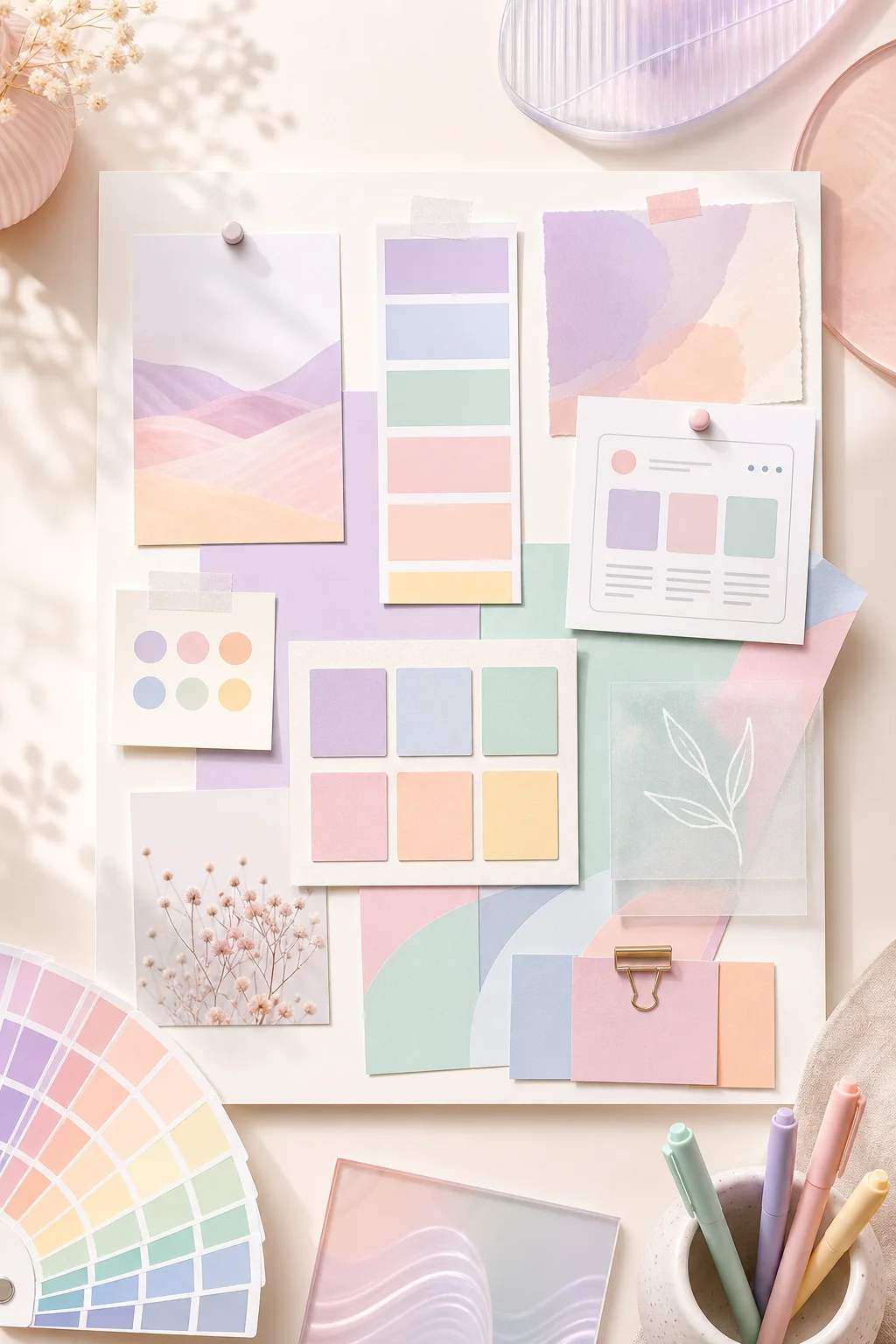
Pastel colors are soft, light, and easy to love. They can make a design feel calm, friendly, elegant, playful, or modern depending on how they are combined. That flexibility is why pastel palettes are so popular in branding, websites, social media graphics, packaging, stationery, and creative campaigns.
Unlike highly saturated colors, pastels usually feel gentle and approachable. They can add personality without overwhelming the viewer, which makes them especially useful when a design needs to feel inviting, polished, and easy to read.
Pastels Create a Calm First Impression
One of the biggest reasons to use pastel colors is the emotional tone they create. Pastel shades often feel peaceful, optimistic, and balanced. They are less visually aggressive than bold primary colors, so they can help a design feel more relaxed from the first glance.
This makes pastel palettes a strong choice for brands and projects that want to communicate softness, care, creativity, wellness, beauty, clarity, or warmth.
They Make Designs Feel More Approachable
Pastel colors can soften the personality of a visual identity. A bright red, blue, or green may feel energetic and direct, while a pastel version of the same color can feel more welcoming and human.
That is useful for:
- wellness and lifestyle brands
- beauty and skincare businesses
- wedding and stationery design
- educational content
- creative portfolios
- social media templates
- friendly SaaS and app interfaces
Pastels help designs feel less intimidating while still giving them a clear visual style.
Pastel Palettes Are Great for Layering
Because pastels are light, they work well as backgrounds, section colors, cards, highlights, and decorative accents. You can layer several pastel tones together without creating too much visual noise.
For example, a soft lavender background can pair with blush cards, mint accents, and powder blue illustrations. The result feels rich and expressive, but still clean and breathable.
They Support Clean, Modern Layouts
Pastels are especially effective in modern digital design because they create visual separation without relying on heavy borders or dark blocks. A soft pastel surface can separate one section from another while keeping the overall page light.
This works well for websites, landing pages, dashboards, newsletters, and editorial layouts. Pastel colors can guide the eye, organize content, and make a layout feel more intentional.
Pastels Help Product and Content Imagery Stand Out
Pastel backgrounds are gentle enough to support photos, product mockups, typography, and illustrations without fighting for attention. This is why pastel palettes are common in beauty packaging, stationery flat lays, product launches, Pinterest graphics, and Instagram carousels.
If your content includes photography or detailed visuals, pastel colors can create a soft frame that makes the main subject feel polished and memorable.
They Can Still Feel Professional
Pastel colors are sometimes associated with playful or feminine design, but they can also feel refined and professional. The key is pairing them with the right neutrals, typography, spacing, and contrast.
A pastel palette can look sophisticated when combined with:
- warm off-white backgrounds
- charcoal or deep navy text
- clean serif or modern sans-serif typography
- generous spacing
- one stronger accent color for emphasis
How to Use Pastel Colors Without Losing Contrast
The main challenge with pastels is contrast. Because pastel colors are light, they may not be strong enough for body text, small labels, buttons, or important interface states.
Use pastels for backgrounds and supporting elements, then pair them with darker text colors. Deep navy, charcoal, forest green, plum, and warm brown can all work well depending on the mood of the palette.
For buttons and calls to action, use a slightly stronger version of your pastel accent or combine a pastel background with a dark readable label.
Best Uses for Pastel Colors
Pastel palettes work beautifully when the design needs to feel soft, optimistic, and visually calm. They are especially effective for:
- brand mood boards
- beauty and skincare packaging
- wedding stationery
- lifestyle blogs
- wellness apps
- children’s products
- creative portfolios
- soft editorial websites
- social media templates
- spring and seasonal campaigns
The best pastel designs do not rely on softness alone. They combine gentle color with clear hierarchy, strong spacing, readable typography, and a purposeful accent.
Final Thoughts
Pastel colors are useful because they make designs feel approachable, calm, and visually pleasant. They can support modern layouts, soften a brand identity, and create a memorable atmosphere without overwhelming the viewer.
When used with enough contrast and a clear structure, pastel palettes can be much more than pretty colors. They can become a practical foundation for branding, websites, content design, and creative visual systems.